Monday, June 24, 2013

Relax and unwind layout (for BBTB2)

I'm all about some summer fun!  We are having an inspiration week (with no challenge) over at BBTB2, featuring summer fun.  I've made a layout for a few of my summer pool pictures.  The kids spend a LOT of time in our pool, so I always have lots of pool pictures.  I had so much fun creating my poolside scene, using the H2O and CM Traveler cartridges.  The great title and palm trees (fictional, since we don't have those here in the Midwest, but I can imagine...) are from the CM Traveler cart.  The mom and all the kids are from H2O.    The paper is leftover from an older Bo Bunny collection called Barefoot Bliss.


Cricut:
CM Traveler-title words
H2O-all other cuts
Paper/Stickers-Bo Bunny Barefoot Bliss prints, CTMH and CM solids
brown chalk ink/foam tape

So doesn't that look like fun?  Trade the palm tree for some oak trees and that's where I'm going to be this afternoon with my crew of boys!  The DT have great projects up at BBTB2 for you to see, so enjoy browsing and hope you have a great week with some summer fun in it!


Carefree Energy layout (for PDE challenges)

It's an anything goes challenge at Pause Dream Enjoy!  I've made a layout for some pics of my boys playing outside, using Graphically Speaking for the titles and Locker Talk for the play equipment.  The fun print paper is from the My Mind's Eye Boy Crazy collection (which is awesome-if you check out my Programmed to Play post from 6/21, there is another layout with it).


Cricut:
Graphically Speaking-titles
Locker Talk-play equipment
Paper-My Mind's Eye Boy Crazy collection prints, solids-CTMH
brown chalk ink

Here are the challenge details:

Pause Dream Enjoy (PDE) Ch# 13 Anything Goes
Begins: Monday, Jun 24
Ends: Sunday, Jul 7
Sponsor: The Robin's Nest http://robinsnest-scrap.com/
Prize: $15 Gift Certificate
2nd Sponsor: My Craft Spot http://craftspotbykimberly.blogspot.com/
Prize: 1 Metal Dies Set or 1 Stamp Set (winner's choice) MUST HAVE USA ADDRESS

This will be my last project for Pause Dream Enjoy. Janis has recently become an SU consultant and is changing up Pause Dream Enjoy Challenges to reflect SU products (for the design team, anyway). So if you need any SU supplies, she will have a place for you to shop! While I have quite a few SU stamps, I don't have any current products, so I am stepping down from the DT. It has been a blast!

Friday, June 21, 2013

Programmed to Play layout (for Exploring Cricut)

I have the fun of showing the daily project at Exploring Cricut today!  So, tell me I'm not the only one who gets sucked into buying scrapbooking paper when they didn't plan to.  I went to Archiever's ONLY to buy some adhesive (as scrapbooking had come to a grinding halt without adhesive), but I walked out with the entire My Mind's Eye Boy Crazy collection of paper!!!!!   There was this fantastic robot paper-it was so cute-and the robots talked to me and said I had to buy the paper to make cool boy scrapbook pages.  That's my story for hubby anyway and I'm sticking to it.  Here's what the robots talked me into:


For my layout, I used the robot paper for the background and cut out a robot from the Robotz cart, pairing it with the collection's robot sticker.  I used the funky Robotz font for the title.

(I have pictures of the kids playing this computer game called Minecraft that will go on my layout.  This game has taken over the boy pre-teen/teen part of the population!  My sons and their friends were discussing how to open portals to the next dimension, over dinner.  Really.  You can't make this stuff up!)

Cricut:
Robotz-all cuts
Paper/Sticker-My Mind's Eye Boy Crazy collection
brown chalk ink/foam tape

Wednesday, June 19, 2013

On Vacation layout

The Die Cuttin' Divas challenge this week is Refreshing Summer, so I'm linking up a vacation layout I just finished.  For me, the most relaxing, refreshing thing I can do in the summer is hanging out at the beach or pool while on vacation, far away from all chores and responsibilities.  I used the Pack Your Bags cartridge for all my cricut cuts and the paper is from Echo Park's A Perfect Summer collection.


Cricut:
Pack Your Bags-all cuts
Paper/stickers-Echo Park A Perfect Summer collection prints, solids CM
brown chalk ink

Monday, June 17, 2013

Drive In Father's Day card (for Exploring Cricut)

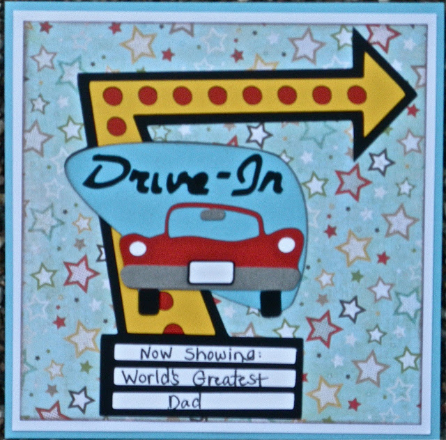
It's Monday and that means a new challenge for Exploring Cricut!  Diane has challenged us to use a Father's Day theme on a project this week.  I have been playing with the Nifty Fifties cartridge a bit and decided to try and think outside the box for my Father's Day card and this is what I came up with!  I used the drive-in sign and hand-wrote my sentiment.  I think my Dad will like this a lot!


Cricut:
Nifty Fifties-drive in sign
Paper-
Stamp-from the dollar bin
Ink-SU Close to Cocoa

Go check out the rest of the Design Team projects at Exploring Cricut and I hope you will come play along with a project!

With a Cherry on Top b-day card (for BBTB2)

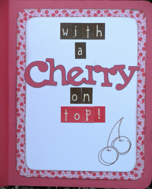
Our BBTB2 challenge this week is Summer Foods!  Well, that leaves a whole lot of possibilities open, but I think of ice cream when I think of summer.  So an ice cream sundae project came to mind!  I made a birthday card with the ice cream sundae from Nifty Fifties and used some letter stickers and the word "cherry" (also from the cartridge) to make my sentiment:  happy b-day with a cherry on top!   The cute cherry background paper from Echo Park inspired the sentiment.


Cricut:
Nifty Fifties-ice cream sundae, word cherry
Paper-Echo Park A Perfect Summer cherry print, stickers are from an old Echo Park collection, solid paper is CTMH
brown chalk ink
stamp-????

The BBTB2 designers have a great collection of projects to inspire you for this yummy challenge!  Get crafting and play along over at BBTB2 this week ;)

Thursday, June 13, 2013

Father's Day BBQ layout

This weekend is Father's Day!  To celebrate the fathers, my extended family is getting together this weekend for a BBQ (my dad got an amazing new smoker-so we HAVE to test it out...as many times as needed, lol!).   We are getting him a collection of different barbecue sauces for his gift, which I think he will like.  I made a fun layout using 3 Birds on Parade with the grilling bird and the great font with the bird feet for the title!  I found some paper that kinda made me think red checkered tablecloth and it went from there.


Cricut:
3 Birds on Parade-bird, grill, title font
A Child's Year-journal box
brown chalk ink
K & Co stickers
Paper-Colorbok Beach collection

I'm going to link this to the Fantabulous Cricut Father's Day challenge and the Little Scrap Pieces Father's Day challenge.

Monday, June 10, 2013

School Dance layout (for PDE challenges)

It's time for a new Pause Dream Enjoy Challenge and it's a "make a layout" challenge!  Now that is MY kind of challenge for sure, since a layout is my favorite crafty thing to make!  This layout is EXTRA special and fun, as it is about Son#1's first school dance earlier this month.  It was really shocking to realize that he is actually old enough to go to a dance with a girl!  I used the Formal Occasions cartridge for almost everything on this layout, including the scene with the "red" carpet, title, flowers, and journal box.  The font for 2013 is from Baby Steps, as the Formal Occasions cart does not have a font.   The challenge details and prize are at the bottom and we'd love to have you link up with a project!


Cricut:
Baby Steps-2013 font
Formal Occasions-all other cuts
Paper-DCWV Formal Occasions stack gray toned print bg papers, DCVW Far East stack blue toned print bg paper, CTMH solids
brown chalk ink

So here are the challenge details:
Pause Dream Enjoy (PDE) Ch# 12 Make a Layout
Begins: Monday, Jun 10
Ends: Sunday, Jun 23
Sponsor: The Scrapbooking Queen ttp://www.facebook.com/groups/328648037235767/
Prize: "Royal Wedding"
(must have USA address)

In the kitchen layout (for BBTB2)

It's Monday-time for a new challenge at BBTB2.  Our awesome DT sister Shelley has challenged us to make a project about something in the kitchen this week.  I broke out my newest cartridge Suburbia, as I've been eager to use some of the super cool retro kitchen images on it.  I've made a kitchen layout, which will be for some pics of our extended family having fun together whipping up some BBQ with all the fixin's.  My cook is in the kitchen with her fridge and stove, making some great potato salad and chocolate cake to go with all that BBQ goodness.  I wanted the paper to feel kind of vintage like a Grandma's kitchen, and I found some really pretty Echo Park paper in my stash that fit the bill!


Cricut:
Suburbia-all cuts
Paper-Echo Park prints, CTMH solids
brown chalk ink, pop dots

We'd love to see your projects!  Just use a kitchen themed cricut cut and remember, it must be a NEW project!  The rest of the design team has some fabulous projects to inspire you, as always, so go check them out at BBTB2.

Friday, June 7, 2013

Movie Night layout (for Exploring Cricut)

Today is my day to show a daily project at Exploring Cricut!  I have a layout about the movies, inspired by this fun Karen Foster film reel background paper!  One of our favorite family traditions is movie night, where we all curl up in the living room to watch a movie together with popcorn and pizza (along with a fire in the winter).  It's super fun (we pick the movie from Netflix) and MUCH cheaper than the theater!  With a couple of kids, who can afford the theater these days?  Plus you can have much better snacks at home.

My layout is for some pics of a movie night with friends recently.   I cut the filmstrip from Mickey and Friends (also the star) and cut it in half diagonally to visually connect the two pages.  The popcorn and soda cuts are from the Carousel cartridge.  The font is my absolute favorite:  the Mickey Font.


Cricut:
Mickey Font-title font
Mickey and Friends-star and filmstrip
Carousel-popcorn and soda
brown chalk ink
Paper-Karen Foster background paper, CTMH and CM solids

I hope you enjoyed this layout and check back every day at Exploring Cricut for a new daily project to inspire you!

Monday, June 3, 2013

Sweet Treats layout (for Exploring Cricut)

Who screams for ice cream?  Everyone at my house, that's for sure!  Our Exploring Cricut challenge this week is celebrating National Ice Cream month, with the challenge being to use ice cream or a popsicle on a project.  I went with ice cream-we make a lot of homemade ice cream at our house.  We've worn out the ice cream freezer, in fact, and I'm shopping for a new one!  Homemade double dutch chocolate, strawberry with chunks of strawberries, or sweet delicious vanilla- it's all SO yummy!

My layout (for some birthday pics of us eating ice cream) uses the Birthday Bash cartridge for the title, ice cream sundae, and banners.  I added some Diamond Glaze here and there for extra shine.  The paper is from the Carta Bella Cool Summer collection.

the whole layout:

doesn't the pink paper look yummy with the Diamond Glaze?

a little more Diamond Glaze on the cherry and the strawberry ice cream:

Cricut:
Birthday Bash-all cuts
Paper-Carta Bella Cool Summer
brown chalk ink
Diamond Glaze
Swiss Dots embossing folder

Join us over at Exploring Cricut in this yummy challenge with your ice cream or popsicle project!  The design team has some delicious projects to look at for inspiration.

Cute as a bug layout (for BBTB2)

Ladybugs are the challenge theme this week at BBTB2!  I couldn't wait to do this one-I've been going through some old baby pictures of the kids and this will be the perfect layout for a few of them.  Ladybugs are the only kind of bugs I really like because they are actually cute!

I used the CM This and That cartridge, as it it had this "cute as a bug" phrase for my title (even including a ladybug!).  I added another ladybug, also from the cartridge,.  It's all in soft candy colors inspired by my background paper from My Mind's Eye (the photo mat paper is from Echo Park).  I added some little dots (also from MME) for the ladybug eyes, just for fun!  Sorry my pics are not ideal-I really struggled with the lighting the day I took these, as there was a serious lack of sunshine.  I tried to lighten them up, which washed out the color!  Suffice to say, it is much prettier in real life!

so here we have my complete layout, which I had to photo edit the heck out of with only so-so results:

the colors are more true to life here:


Cricut:
CM This and That-all cuts
Paper-BG paper is My Mind's Eye The Sweetest Thing collection, Photo mat paper is Echo Park Sweet Day, solids are CTMH, journal box and smile card are Simple Stories Vintage Bliss collection
brown chalk ink/pop dots

The design team has made some adorable and fun ladybug projects for inspiration, so check them out and come play with a ladybug of your own!